INDUSTRY:
DeFi
CLIENT:
Hanju
YEAR:
2025
EXPERIENCE:
Product design
Hanju
about.
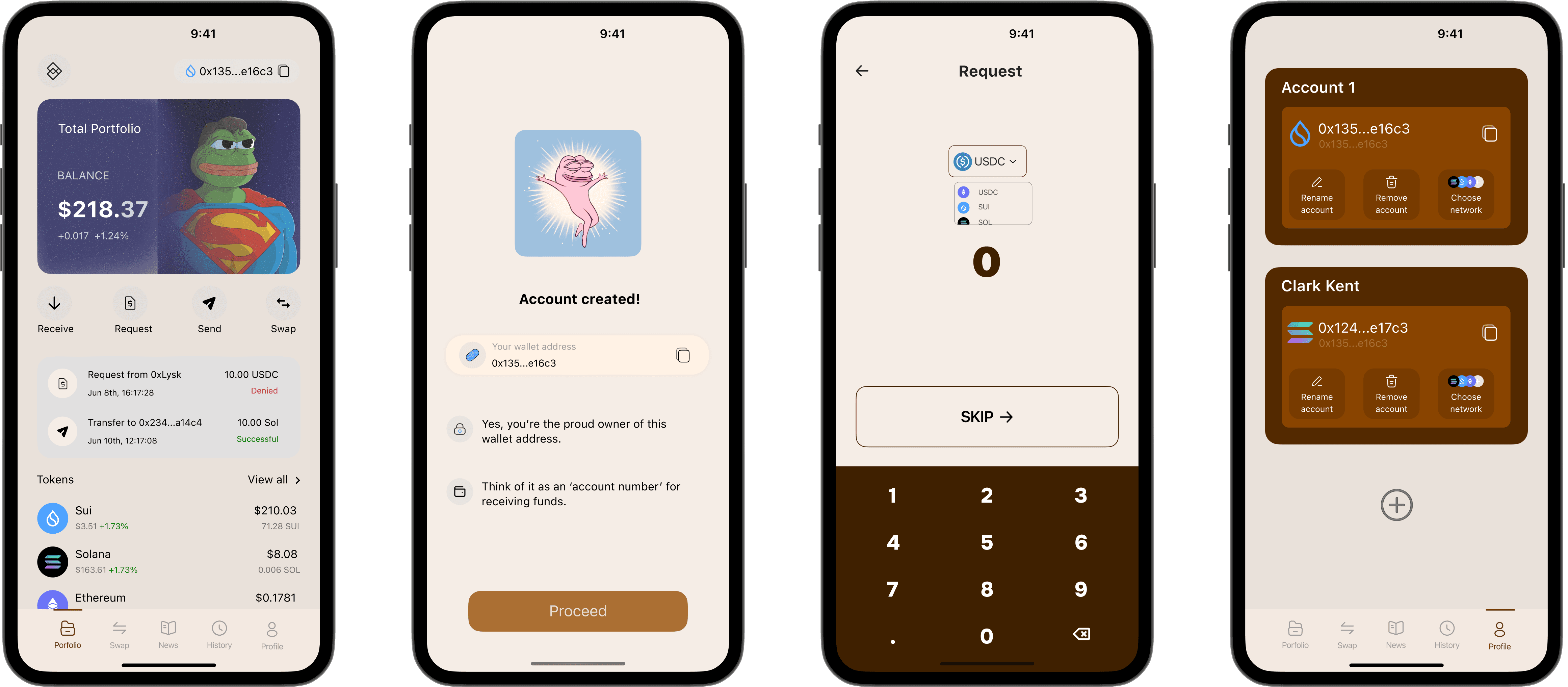
Hanju is a modern DeFi app built on the Sui blockchain that makes managing crypto as easy as sending a message. Whether you need to send funds, receive payments, or request crypto from family and friends, Hanju gives you a seamless, intuitive experience — without compromising on security or performance.
Powered by Sui’s low-latency, high-throughput architecture (including its Move language and object model) that enables fast, low-cost transactions, Hanju delivers:
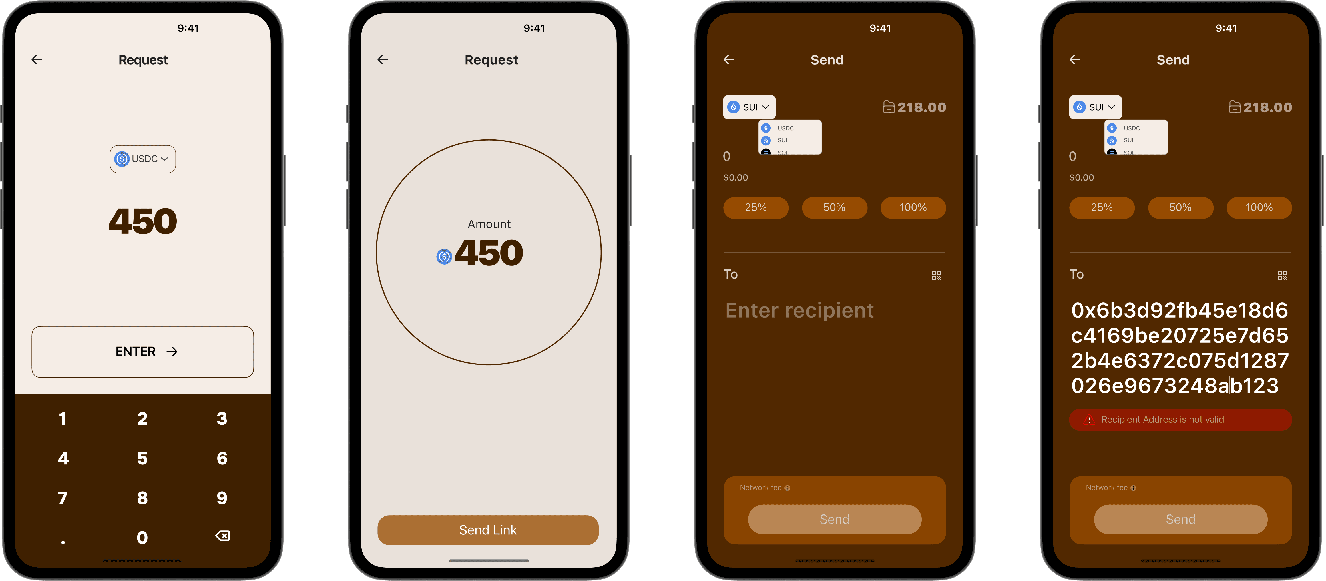
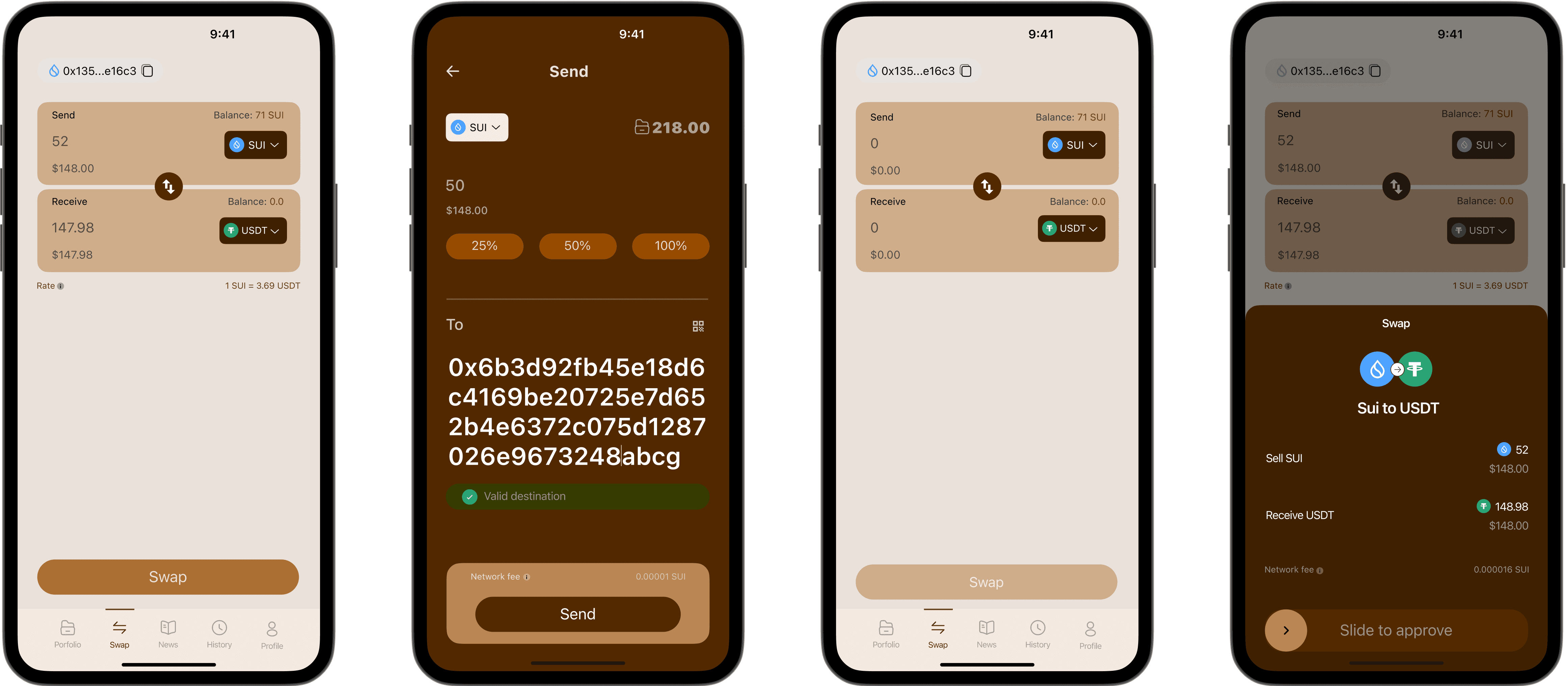
Send & Receive: Instantly send crypto or receive assets with minimal friction. Wallet-friendly features make asset transfers feel simple and familiar.
Request Money: Easily ask friends, family, or peers for crypto via a request feature: generate a payment request, share it, and get notified when funds arrive.
Security & Trust: Built with best practices for key management and privacy. Transactions are secured on Sui, benefiting from its consensus and rapid block finalization.
User-First Design: No heavy crypto-jargon required. Clean interface, clear feedback on transactions, responsive performance on mobile and web.
challenge.
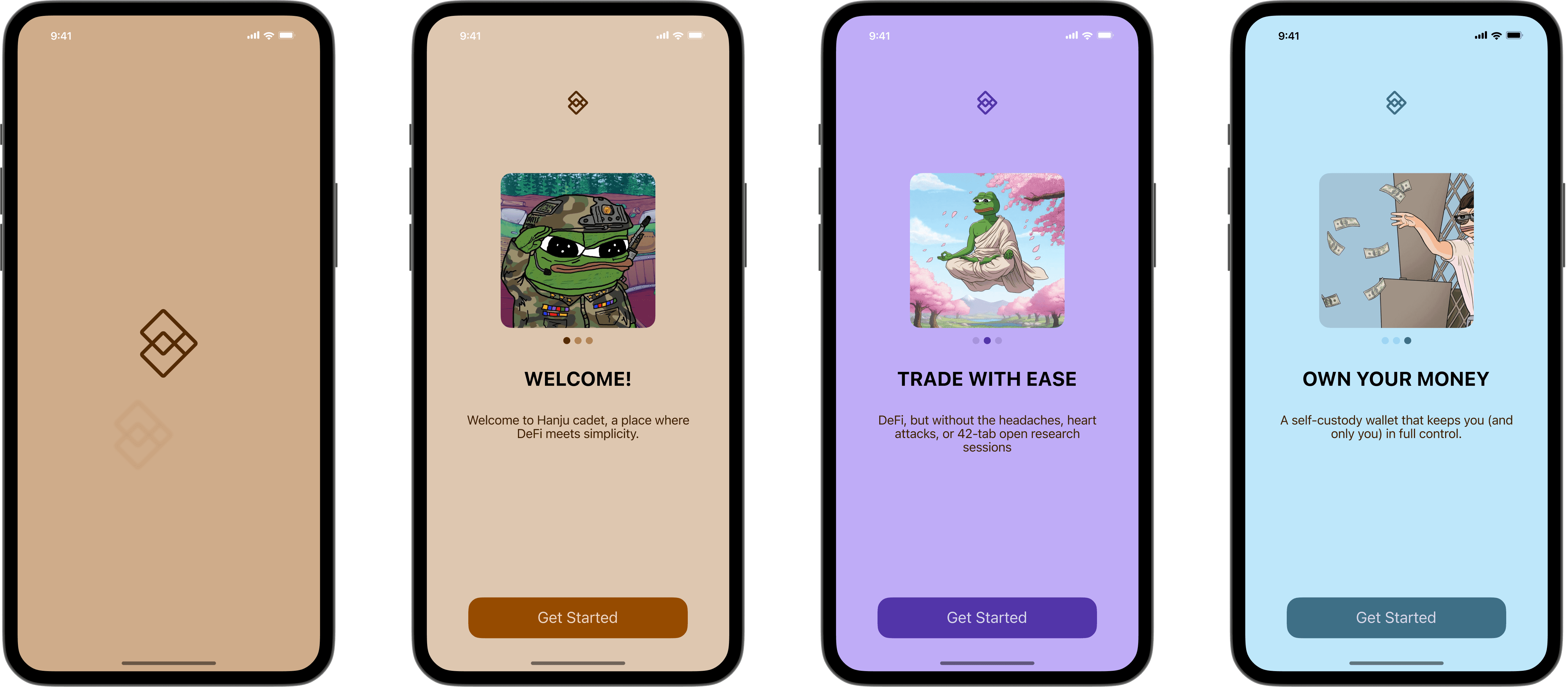
One of the biggest challenges was designing mockups that looked great and worked well in the complex world of Web3. Web3 interfaces tend to be confusing: transaction confirmation flows, wallet connections, cryptographic alerts, network fees — all of which can overwhelm users. My goal was to reflect that complexity in a way that’s understandable, not intimidating.
Each mockup needed to display designs realistically (no distortion, no blurry screens), manage light and reflections so content remains legible, and accurately show how UI would behave in real conditions. At the same time, I built a customization system so users could tweak mockups of different graphic styles easily — allowing designers to see how their UI will look under different finishes, lighting, or environments without losing clarity. The result: mockups that demonstrate Web3’s inherent friction but present an interface that feels polished, trustworthy, and usable.

result.
Results
The mockups became far more realistic and trustworthy: the improved handling of light, reflections, screen glare, and perspective meant UI elements stayed crisp, legible, and true to how users would see them in real Web3 apps.
By building a flexible customization system, I enabled quick adjustments of style (e.g. lighting, device angle, environment) without losing fidelity — this reduced mockup production time by ~40% (fewer manual tweaks) in the latter stages of the project.
Feedback from users and stakeholders showed greater confidence when reviewing designs: they felt the mockups better communicated how the Web3 UI would feel in real use, especially hard work-flow parts like wallet connections or transaction confirmations.
Internally, the better mockups helped catch UI problems earlier: things like reflections obscuring text, or device bezels cutting off important cues, which were missed in earlier, less refined mockups. Fixing those earlier reduced downstream rework.
The end result was that the portfolio project looked more polished, professional, and credible — reviewers (design leads / peers) consistently mentioned mockups as a highlight, noting both visual appeal and usability clarity.